 There’s a reason why the digital design mavens at mega-tech companies like Microsoft, Samsung and Apple are going to minimalist graphical user interfaces.
Win 8 and the new iOS7 are both about as plain-Jane as you can get. Thin lines, no borders, subtle colors, and lots of open space. It could be just a creative design trend. All things eventually change (which is why I never throw away an old tie).
But long before the big tech companies got involved, the ongoing wisdom for an optimal freelance voice-over site was simplicity.
Your VO website is mainly for people to hear your demos, get some contact information, and maybe learn something about you they didn’t know. In that order.
But lately I’ve noticed some great reasons why your VO business card should also espouse the VO website simplicity.
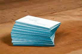
I’ve seen some VERY creative voiceover business cards. sweeping and colorful themes, artistic flair, fetching tag lines, and innovative eye-catching graphics. I’ll offer this pic of my own business card along those design-lines (front & back):


I’ll tell you the reason why I think I’m going to redesign my bizcards, and then I’ll tell you the real reason you should also seek a simple business card.
First, no one can read my card. White or blue words on a black background require special attention to get the basic info. Add to that the super-slick glossy finish I chose for this card, and you’ve got a practically unreadable card. Finally, there’s no place to jot down any information on this card. Bizcards always make a handy notepad to scribble some quick information about/from the person who just handed you his/her card. I pre-printed info on both sides of my card, so… no notepad.
Now, here’s the real reason you should choose a simple simple simple design for your business card…and I’m speaking from the voice of experience.
Almost everyone now uses digital card readers, their smartphone, or their tablet to scan YOUR card into THEIR address book. No matter what that device looks like, it means taking a picture of the card, and then hoping the artificial intelligence built into the app will be able to decipher the hen-scratches on the card. The app then plugs in what it THINKS is your phone number and the email, and the website URL into it’s form.
Those apps are getting better and better, but even the really good ones can’t make any sense out of fancy-dancy cards (mine included). It just returns gobbledegook to the form. That means you have to go back and enter all the information by hand, which defeats the purpose and convenience of the app. After a few of those kinds of cards you come to recognize in advance the cards that aren’t going to be readable.
And you know what happens then?
THOSE hard-to-read cards get set aside…ignored…or procrastinated. Sometimes they NEVER make it into the database of a possible client…and THAT’S why a simple, easy-to-read, hi-contrast, bold-font business card is best.
Here are a couple of cards that more meet the “simplicity” mandate. Even my AudioBook narrator card is still a little frilly, but scans just fine. BTW, I use ScanBizCards to scan all the business cards I get, now.

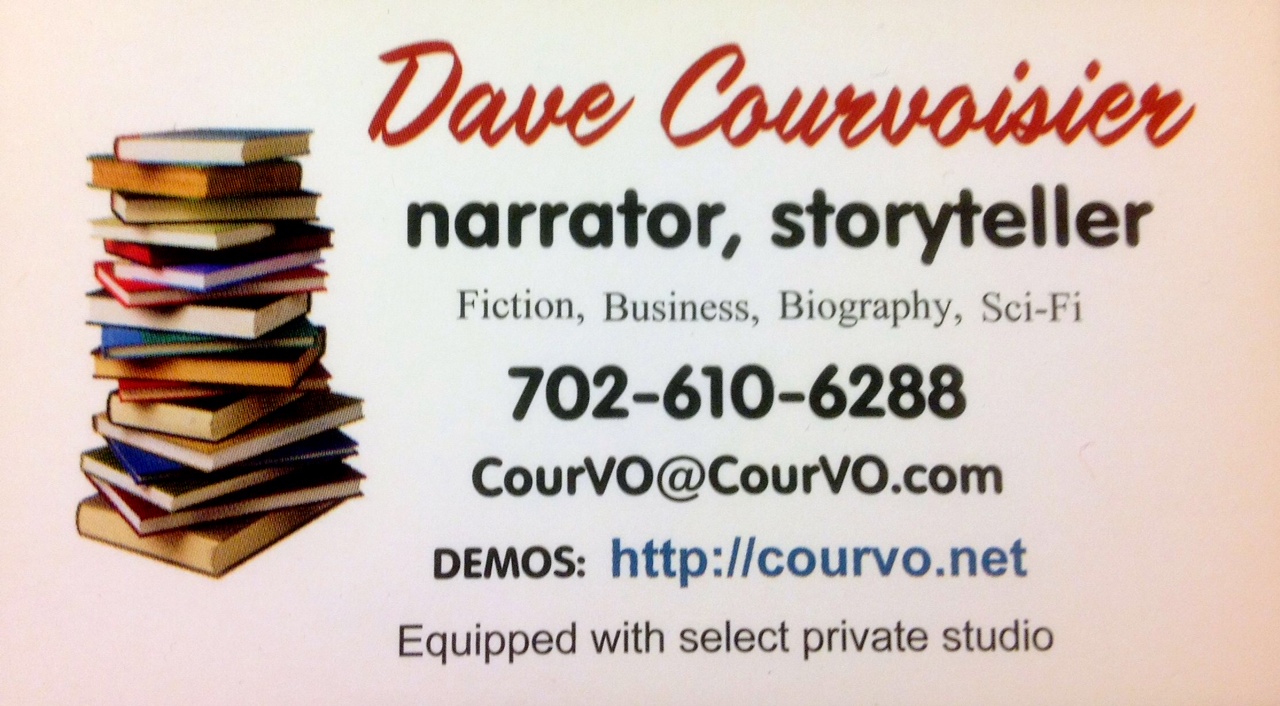
CourVO
